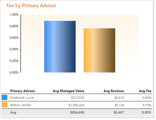
This chart graphic shows fee percentage (Series/Y axis) by Primary Advisor (Category/X axis). The chart breakdown shows averages for Managed Value, Revenue, and Fee percent for each Primary Advisor. The Primary Advisor is based on users assigned to that field on active Household Accounts. The final Avg row is a calculation of the averages across all Primary Advisors.