
Contents
Reporting
MoneyGuide Dashboard Updates
What's changing
Firms that use MoneyGuide now benefit from a more integrated financial planning dashboard that shows primary navigation and detailed MoneyGuide plan insights directly in Tamarac. The new dashboard shows you MoneyGuide data right in Tamarac where you’re already working, helping you access client information faster, reduce clicks, and improve plan visibility.
Notes
Your firm must have the MoneyGuide integration enabled to see these pages.
The updated dashboard includes the following:
-
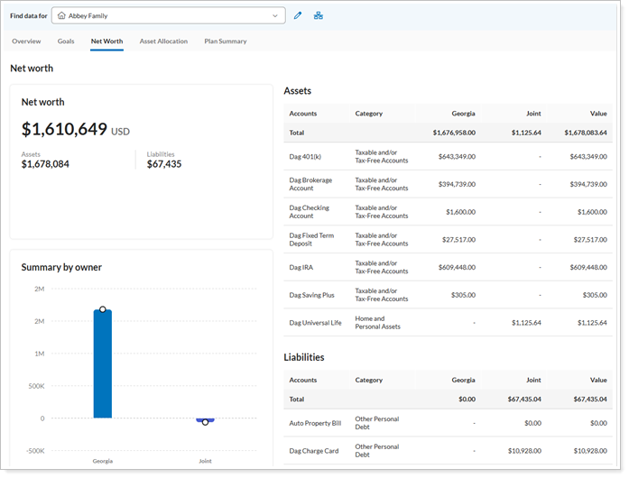
Net Worth page. View a consolidated summary of a client's assets, liabilities, and net worth over time.
-
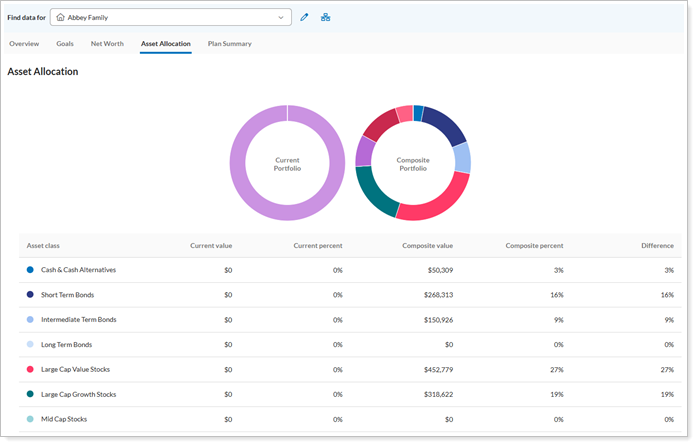
Asset Allocation page. Review interactive views of current and target allocations, including variances across asset classes based on MoneyGuide data.
-
-
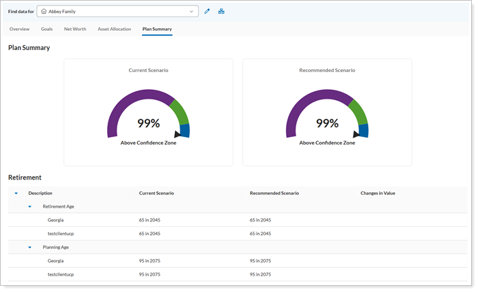
Plan Summary page. See key plan metrics in one place, including probability of success, funded status, and major goal coverage.
-
Switch between households on the dashboard. Use the Find Data For search to search for and switch between households from any MoneyGuide Summary page without returning to the main Households page.

-
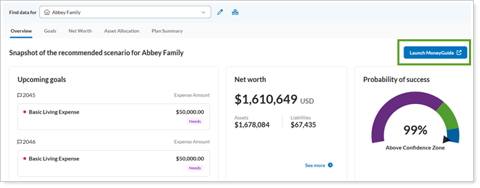
Access MoneyGuide directly. Launch the single sign-on (SSO) to open MoneyGuide directly from Tamarac to view an existing plan or start a new one.
Why you'd use it
Save time by viewing a client’s financial health where you’re already working—in the Tamarac platform. These enhancements reduce the time you have to spend switching between Tamarac and MoneyGuide, while also making it easier to launch MoneyGuide directly from Tamarac to continue your planning workflow.
How to get started
To access these pages, on the MoneyGuide dashboard, select the tab for the page you want to see.
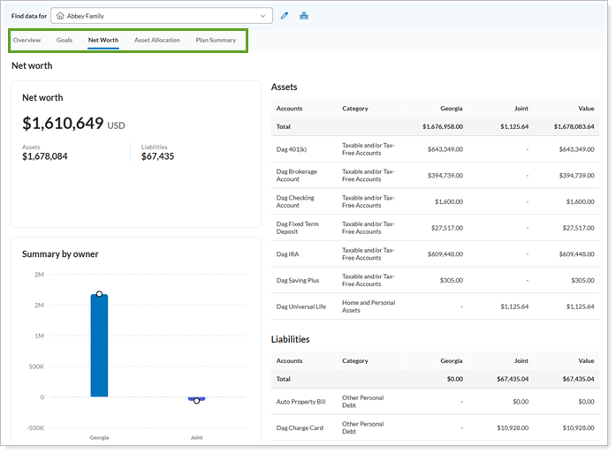
To switch clients, in the Find Data For list, search for and select the desired client record.
To edit a plan, select Launch MoneyGuide to open the MoneyGuide client record.
Additional Information
For more information, see:
Automated pricing updates for delayed DST data files
What's changing
Pricing files are critical to your daily workflow, and when they arrive outside of the expected timeframe, this can cause problems. In the past, when the most recent DST data was unavailable, you had to adjust pricing information manually. Tamarac now automatically processes delayed DST pricing files and applies updated prices to the appropriate historical dates when they become available.
When pricing data appears in multiple file types, Tamarac prioritizes them in this order:
-
Price files.
-
Position files
-
Transaction files.
Why you'd use it
This enhancement minimizes manual pricing adjustments and reconciliation errors caused by delayed custodian files. Tamarac automatically applies backdated prices from DST feeds to help maintain accurate performance reporting, billing values, and quarterly reports, even when fund providers deliver data after weekends or holidays.
How to get started
No action is needed. These changes will apply after the release.
Automatic commercial paper pricing for NFS and IWS custodians
What's changing
If your clients hold commercial paper assets at National Financial Services LLC (NFS) or Fidelity Institutional Wealth Services (IWS), Tamarac now shows more accurate market values for those holdings.
Previously, NFS and IWS priced commercial paper differently than other security types, which could cause these holdings to appear at 1/100 of their correct value unless you corrected the price manually. Tamarac identifies commercial paper securities in NFS and IWS position files and multiplies the market price by 100 to align custodian pricing with Tamarac valuation requirements.
Notes
Commercial paper positions may appear as CB, CD, or MB security types in Tamarac. Tamarac applies the pricing logic based on the custodian’s commercial paper designation, so these holdings can be valued correctly even when they use different platform security types.
Why you'd use it
This feature ensures that market values for commercial papers from NFS and IWS remain accurate for client holdings without manually correcting prices. This update improves data consistency, performance reporting, trading data, and billing accuracy for clients who hold commercial paper at NFS or IWS.
How to get started
No action is needed. These changes will apply after the release.
Enhanced bond factor handling and security mapping
What's changing
Accurate client account reporting is essential to your business. This release improves fixed income data accuracy through automated factor detection and refined security mapping. Tamarac now identifies factorable bonds more reliably and classifies them correctly during exports.
Why you'd use it
This enhancement reduces the need for manual security master updates to maintain fixed income securities and helps ensure that both factorable and non-factorable bonds are mapped to the appropriate security types.
By automatically identifying factorable bonds and aligning factor data with custodian records, Tamarac helps improve the accuracy of performance and yield calculations. It also helps prevent performance spikes, amortization issues in Trading, and other reporting inconsistencies associated with complex debt instruments.
How to get started
Automated factor detection and security mapping are enabled by default for all users. To use custodian-specific factors, an administrator must enable the Use Custodian Factors setting at the exporter level. Once enabled, Tamarac automatically retrieves and applies custodian factors during the export process.
Once enabled, the Tamarac platform will automatically pull the relevant custodian factors for your exports.
Report Studio
Enhanced Report Studio experience on mobile devices
What's changing
We’ve updated Report Studio to work better on mobile devices. These enhancements help you create, view, and share interactive reports from your phone or tablet, whether you’re on the go or presenting to clients. Now, layouts adjust to your screen size, touch controls are easier to use, and content is clearer and easier to read. Improved navigation also helps you access and analyze your data from anywhere.
Why you'd use it
Use this enhancement to review and present reports from your phone or tablet with confidence.
How to get started
No action is needed. These changes will apply after the release.
Additional Information
For more information, see Introduction to Report Studio.
Include Allocation Over Time charts in Report Studio reports
What's changing
The allocation over time chart visually illustrates where clients were invested over time and how it changed, an important element to understanding the impact of allocation on performance. Now, you can include allocation over time in Report Studio reports, helping your clients better understand shifts in portfolio composition
Based on the existing allocation over time chart available in Tamarac Reporting and client portal, this module brings a familiar visualization directly into your reports.
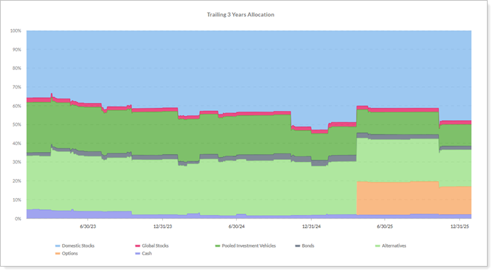
With this module, you can:
-
Customize the data display. Show chart data by value or weight.
-
Group and sort categories. Group once, then sort by name or value.
-
Show or hide data labels. Show or hide the category name, ending weight, or ending value.
-
Apply category filters. Include or exclude categories to refine the chart.
Why you'd use it
Use the Allocation Over Time module to help clients understand how their portfolio's asset allocation has changed over time. This visualization shows the effects of market performance and rebalancing decisions, making allocation changes easier to explain and discuss. By including this chart in your proposals and reports, you can present a more complete picture of portfolio management and demonstrate how you adapt investment strategies across changing market conditions.
How to get started
To start using the Allocation Over Time module, drag and drop the Allocation Over Time module from the library into the desired Report Studio section. Configure the Module settings to select your desired data point and tile type.
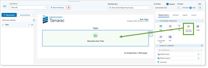
You can then use the Display settings to adjust the alignment, font size, and color preferences to match your firm's branding.
Additional information
For more information, see:
Highlight key metrics in Report Studio
What's changing
Key performance indicators (KPIs) let you track your success based on specific target data points. Reporting on KPIs helps you elevate performance details for clients to find, understand, and discuss. With this release, we introduce a new KPI module in Report Studio that lets you showcase critical performance data as standalone visual tiles in your custom reports. You choose the metrics you want to highlight and organize and size tiles to fit.
On KPI tiles, you can:
-
Group data by allocation category. Choose an allocation weighted benchmark return and group the data by a specific category type.
-
Include benchmark and index returns. Choose from the enabled account benchmarks and indexes to display the most meaninful returns.
Why you'd use it
Use KPI modules to draw attention to the performance details that matter most to your clients, such as total account value, benchmark returns, or year-to-date return. By placing these metrics in prominent visual tiles, you can make reports easier to scan, help clients more quickly understand key results, and guide conversations around the data that needs the most attention.
How to get started
To begin using this feature, open Report Studio and locate the KPI module in the component library. Drag the module onto your report page and use the Module settings to select your desired data point and tile type.
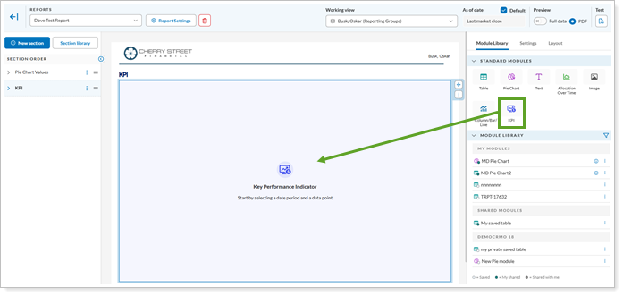
To adjust the alignment, font size, and color preferences to match your firm's branding, use the Display settings.
Additional information
For more information see:
Use custom images in Report Studio
What's changing
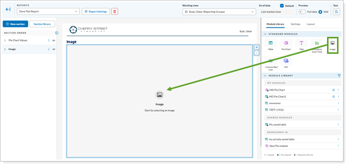
We know your business values customized reports. With this release, you can personalize client presentations with the new Image module in Report Studio. It allows you to add custom graphics and firm-branded visuals, such as firm logos, advisor photos, or other relevant images directly to your reports.
When using this module, you choose an image from the images you’ve already added to Tamarac, or you can upload a new image.
The module supports the following image formats:
-
.bmp
-
.gif
-
.jpg
-
.jpeg
-
.png
-
.pdf
As with all modules, you can position and size the image on a page to fit cleanly in the section.
Why you'd use it
Use the Image module to make client reports more polished and visually consistent with your firm’s brand. Add visuals that support your financial data, such as a firm-wide branding graphic on a quarterly statement cover page or a chart image created outside the platform. You can also ensure that the image fits cleanly where you want it with image spacing, size, and placement controls.
How to get started
To start using the Image module, drag and drop the Image module from the library into the desired Report Studio section and use the Module settings to select your desired data point and tile type. You can then use the Display settings to adjust the alignment, font size, and color preferences to match your firm's branding.
Additional information
For more information, see:
Include Custom Text in Report Studio
What's changing
As an advisor, you want reports to reflect both the data and the guidance you provide to clients. With the new Custom Text module in Report Studio, you can add personalized messages, investment insights, and market commentary directly to your reports wherever is appropriate—even alongside charts and tables. This added flexibility helps you create more meaningful client communications and deliver a more tailored reporting experience.
With the new Text module, you can:
-
Include merge fields. Add dynamic data placeholders that automatically populate client, account, and date information like account name, primary advisor, or mailing label. The available merge fields match what’s currently available for PDF templates.
-
Format text. Adjust the font, text size, and transparency to match your firm's branding.
-
Customize your layout. Place and size the text module to fit your needs.
Why you'd use it
Use this to provide personalized context and professional commentary in your reports. Merge fields, branding alignment, and layout customization help make every report feel tailored to the individual client. Save these modules to your Module Library to reuse successful commentary across multiple client presentations.
For example, you can create a custom executive summary that automatically includes the client name and inception date or add specific disclosures to a proposal without needing to modify the underlying template.
Example
You can create a custom executive summary that automatically includes the client name and inception date or add specific disclosures to a proposal without needing to modify the underlying template
How to get started
To start using the Custom Text module, drag and drop the Custom Text module from the library into the desired Report Studio section, then use the available settings to enter your text and add merge fields.
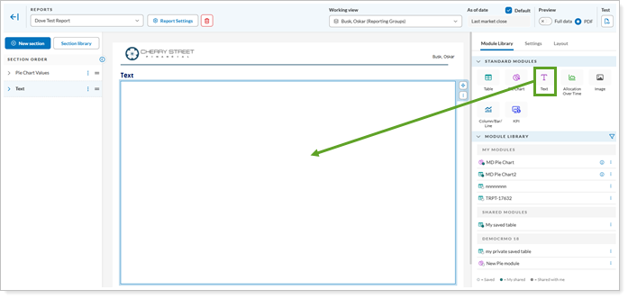
To customize the position and size of the text box, use the Layout Settings.
Additional information
For more information, see: