
Contents
|
See Arch tax documents in the Tamarac document vault Show Category colors in Report Studio tables |
Reporting
See Arch tax documents in the Tamarac document vault
What's changing
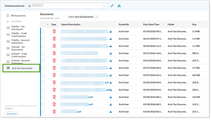
With this release, if you use Arch to manage private-placement alternative investments, you can access tax documents for managed through Arch, including K-1s and 1099s, directly in the Tamarac document vault. The new Arch Tax Documents folder provides a central location to access these documents without leaving Tamarac.
Why you'd use it
If you use alternative investments, you know that getting access to tax documents takes time. In the past, you had to sign in to each separate alternative investment provider’s website to find and download files. This enhancement saves you time by simplifying your workflow and keeping your documents organized.
How to get started
Note
Your firm must have the Arch integration enabled to see the Arch Tax Documents folder. To turn it on, contact your Tamarac Service team.
If your firm has the Arch integration enabled, you can find these documents in the Tamarac document vault under Arch Tax Documents:
Additional information
For more information about the document vault, see Use the Document Vault.
Report Studio
Show Category colors in Report Studio tables
What's changing
Report Studio table modules now include a Show category color keys setting. Turn it on to display a color key for every category grouping bucket in the table and make categories easier to identify across your report.
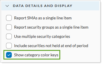
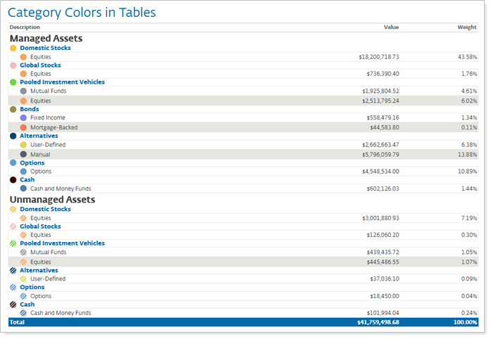
The color keys match the colors used in other report elements, such as pie charts. Use category colors to:
-
See color keys at every grouping level. Color keys are displayed for all category grouping levels, including asset classes or managed versus unmanaged assets.
-
Let Report Studio place keys for you. The system automatically determines when to show color keys based on the grouping levels applied to the table.
-
Match your pie chart legends. Table color keys now align with the behavior found in Report Studio pie chart legends.
Why you'd use it
Matching colors helps you tie your table data to your charts. For example, an asset class shown in a specific color in a pie chart uses in the same color in the detailed data table. This helps clients identify and compare portfolio information across report elements. The result is a more consistent, professional report that helps you explain complex portfolio information.
How to get started
Open a report in Report Studio and select a Table module. In the module settings, select the Show category color keys checkbox. Make sure the table includes at least one category-level grouping, so the color keys appear in the output. You will need to create a color theme for category color keys to use this feature.
Help Center and Tamarac University
Tamarac University has a new home
What's changing
With this release, Tamarac University moves into Envestnet University, Envestnet's centralized learning ecosystem.
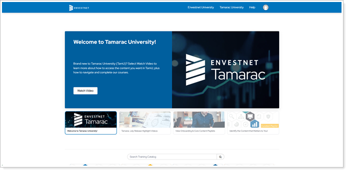
The new Tamarac University space offers the following benefits:
-
Simplified, faster onboarding experience for new Tamarac users.
-
Refreshed existing training content to ensure it reflects the latest platform functionality and best practices.
-
Easier-to-find training with improved organization, playlists, learning paths, and role-based content groupings.
-
Centralized educational content in one learning environment.
As part of this change, Tamarac University access moves from the Support & Training Center menu to the Tamarac platform. The Tamarac University link in the Support & Training Center is removed.

Why you'd use it
This change provides a more streamlined and modern learning experience for you. You get a dedicated learning environment that offers simpler access, improved content organization, and a more consistent user experience.
How to get started
In the Tamarac platform, select Tamarac University.
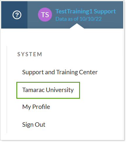
This opens a dedicated Tamarac University experience in Envestnet University, designed specifically for Tamarac users.