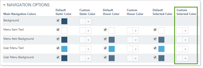
For each customizable element, you can control the color of these elements in certain states. The customizable states are:
-
Hover.Hover is used to change elements when you place your mouse over them.
-
Selected.Selected is used to indicate what page and/or section the user is currently on. In the video below, the selected color is white. When you click the menu item and the page is loaded, the item will display the selected white state.
This setting allows you to customize the menu item background color when the menu item is selected. For more information on using the default color, see Default Selected Color.


To set a custom color:
-
Clear the Default Selected Color check box in for the item you want to customize.
-
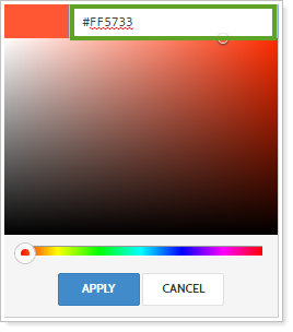
Under Custom Selected Color, click the arrow in the box and select the color you want. To select:
-
Enter the hex code for the color you want, such as #FF5733.
-
Drag the sliders to select a color.

-
-
Click Apply.
For more information on customizing the menu and navigation options, see Customizing the Menu Bar.
For more information on site themes and customizing chart colors, see Site Themes.
For more information about customizing the menu bar, see Customizing the Menu Bar.
