 Back
Back Home > Tamarac Reporting > Clients and Client Portals > Client Portals > New Client Portal > Branding Template Onboarding Guide
|
Back |
Home > Tamarac Reporting > Clients and Client Portals > Client Portals > New Client Portal > Branding Template Onboarding Guide
|
Branding Template Onboarding Guide
You can configure the Envestnet client portal as much or as little as your enterprise or firm needs. If desired, you can fully customize the color themes to ensure that clients see a portal that aligns with your brand.
In this topic, you'll find details on what each Branding theme color controls. It gives examples of how the different branding colors you set up map to what clients actually see. You'll see both light mode and dark mode examples.
Note that these are examples of where colors appear in the portal. It is not a comprehensive list.
Be prepared to share the following inputs with your Envestnet contact:
Your firm logo. The logo image file:
Must be PNG or SVG format.
Must not exceed 1 MB.
Hex codes for your firm's branding colors.
Transparency percentages if any colors have opacity.
By default, client portal templates show a generic logo.
To match client portal branding with an enterprise or firm, you can upload a logo for light mode and a separate logo for dark mode, if desired. The logo you upload appears on the client portal:
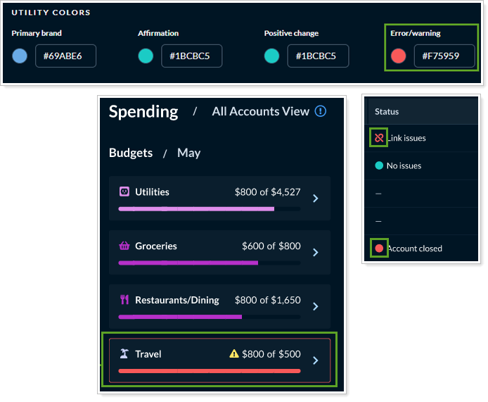
Utility colors highlight components of the client portal that have a specific purpose, such as indicating the performance for a date period has gone up or down.
You control the following utility colors in the client portal.
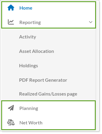
Primary brand controls the color of:
The left navigation menu items when they're selected.
Buttons throughout the portal, such as the Upload File button in Documents.

Affirmation controls the color of positive or confirmatory message indicators.
Positive change controls the color of positive indicators, such as the up arrow on the Account Performance widget.

Error/warning controls the color of notifications and alerts when an issue occurs or when the client may make a permanent change. For example, it controls the color of:
In the Budgets module, the color of the highlight when spending exceeds the budgeted amount for a budget.
On the Accounts page, for Link issues or Account closed statuses or the color of the button and icon when a client deletes an account.
Highlight controls the color of a table row when clients hover their mouse over an item, such as when choosing an item from a menu.

Clients will also see highlight colors on interactive elements on Reports pages. For example, on the Asset Allocation report page, if a client hovers the mouse over the chart, the corresponding row is highlighted.

Finally, highlight colors show up as the background for some alerts and on Reports pages in the settings configuration bar.
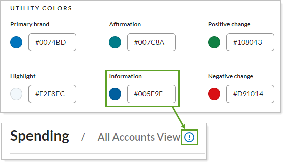
Information controls the color of the ⓘ icon wherever it appears throughout the client portal, such as on the Spending page next to All Accounts View.
Negative change controls the color of negative indicators, such as the down arrow on the Account Performance widget.

Caution controls the color of indicators where the client may need to take action, such as an Actions required status on the Accounts page.

Text colors control all the color of text that appears throughout the client portal, including the left navigation menu text colors, color of links, and the color of body text that appears on all the pages.
You can control the following text colors in the client portal.
Body text controls the color of all the text clients see throughout the portal, including on tables, labels, titles, and more.

The following are a few examples of body text color in the client portal.
On dashboards

On reports pages

On the Documents page

Subtle/hint text controls the color of text in places where text appears but is of slightly lower importance.

For example, it appears in the following locations:
Left navigation menu items that aren't selected.

In Accounts when you add a manual account, the Account Name and Account Number fields that a client can't edit.
Throughout the portal in text that should be offset from standard body text.
Disabled text controls the color of text when there is no action that can be performed by clicking on that text.


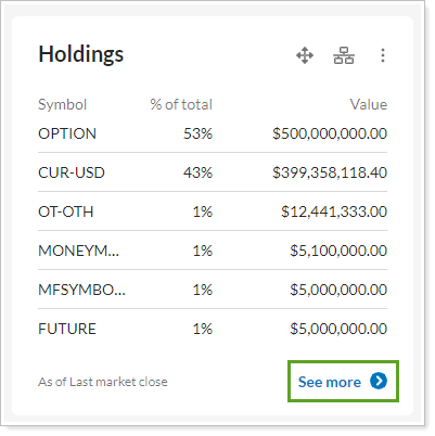
Link text controls the color of hyperlinks, such as the ticker symbol on the Holdings page.


Background/divider colors control the overall background and all the accent background colors, including the color of alternating rows and highlighted rows.
You can control the following background/divider colors control in the client portal.
Primary background controls the base background color the client portal.

For example, you see this color:
In the left navigation menu.
In the background behind dashboard widgets, tables, and data.

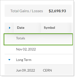
Secondary background 1 controls the color behind some of the summary sections and tiles. For example, this color shades the totals row on the Realized Gains/Losses report.

Secondary background 2 controls the color behind expanded table rows on tables that can expand or collapse sections, such as on the Realized Gains/Losses report when you expand Short Term or Long Term.


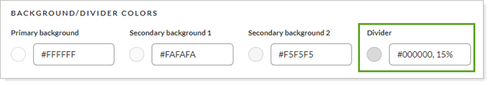
Divider controls the color of divider lines such as on Reporting pages between the Report list and the Show data for list, around some list selection boxes, and between some rows on reports.

Information design colors control the colors of some of the icons and other design elements in the client portal. We recommend leaving these colors as the defaults, since the were designed to work well together.

For example, you'll see information design colors used in:
The color of the user's avatar.

The colors of file type icons on the Documents page.

The following colors are not controlled through the client portal branding color schemes:
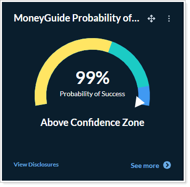
MoneyGuide and Income vs. Spending. The Income vs Spending and MoneyGuide Probability of Success chart colors are controlled in each Reports template. For more information, see Customize Some Page and Widget Colors on Reports Templates.
Asset Allocation page and widget charts. The Asset Allocation chart shows default colors. They cannot be configured.

Budgets. Colors for each budget type are standardized. You cannot configure budget colors.
