
Contents
Report Studio
Assign Report Studio PDFs as default account templates and use in PDF scheduler
What's changing
Report Studio is now available in more PDF reporting workflows, giving you a more consistent way to create, schedule, and save reports from the Accounts and Households pages.
Integrate Report Studio reports in the following places:
-
On the Accounts page: The PDF workflow now shows Report Studio reports in the default template list and labels them clearly, so you can distinguish them from legacy PDF templates.
-
On the Households page: Select Report Studio reports when you generate PDFs for selected households, while existing delivery methods and email notifications continue to work as expected.
-
In the PDF Scheduler: Select Report Studio reports as scheduled template sources, and save a Report Studio report as the default report for specific accounts or groups.
Together, these updates make it easier to use Report Studio across your PDF reporting workflows and maintain a consistent reporting experience for clients.
Why you'd use it
Use this enhancement to create a more consistent reporting experience across the Tamarac platform. Report Studio gives client deliverables a modern, flexible design, whether you generate a report from the Accounts page or schedule recurring delivery with the PDF Scheduler. Saving Report Studio reports as default templates also helps ensure that the right report is ready when you need it.
How to get started
No action is needed. These changes will apply after the release.
Additional information
For more information, see:
Use PDFs as the background image in Section Settings
What's changing
Report Studio now includes section settings that let you add custom background images and PDFs to PDF-enabled report sections. This lets you create branded cover pages and seamlessly include disclosure sections, market commentary, or other client-facing report pages while keeping standard Report Studio modules and headers in place.

You can control how the background appears on the page, hide the section title for a cleaner full-page design, and apply multi-page PDFs as section backgrounds when you need to include longer content.
Why you'd use it
Use this to create highly customized and branded PDF reports that stand out to your clients. You can also use this to include standard firm disclosures or monthly market updates. Combining these custom backgrounds with standard Report Studio modules lets you maintain a consistent report experience while achieving a bespoke visual presentation.
How to get started
No action is needed. These changes will apply after the release.
Additional information
For more information, see Add a background image in Report Studio sections.
New data points and grouping options available in Report Studio
What's changing
Report Studio now includes expanded data points and grouping options across committed capital, net worth, account analytics, and tax planning. These updates give you more reporting flexibility, help you recreate legacy PDF template sections, and make it easier to build comprehensive reports that support clients with complex financial needs.
The new data points include:
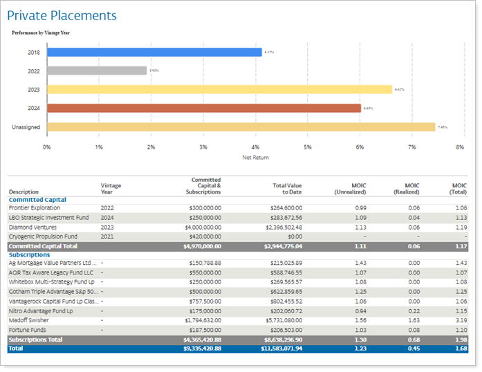
Committed capital. New data points including MOIC (Unrealized), MOIC (Realized), Total Value to Date, and Committed Capital & Subscriptions are now available, along with a new Group by Vintage Year option.
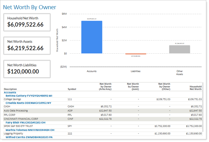
Net worth reporting. You can now generate household net worth reports using new columns such as Household Net Worth, Net Worth Assets, and Net Worth Liabilities. Additionally, you can group by net worth category or owner.
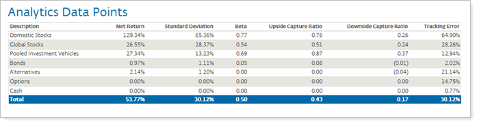
Account analytics. Account analytics data points, including Standard Deviation, are now available as columns in the Table module. In addition to account- and group-level reporting, this analytics data is now available at the category and position levels, representing a significant enhancement.
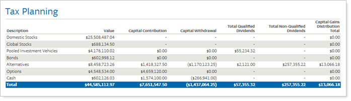
Tax planning. Report Studio now features a comprehensive suite of tax planning data points including long- and short-term capital gains and losses and realized gains and losses, federal and state taxable dividends and interest, and more. These data points bring together all the account activity details tax planners need in one place.
Why you'd use it
Use these updates to give clients a more complete view of their financial picture in a single, professional report. You can create specialized reports, such as Comparative Review Tax Planning reports or detailed net worth statements, directly in Report Studio. Vintage year grouping helps clients track private investment performance over time, while account analytics at the position, subtotal, and total levels let you include risk and performance metrics throughout the report.
How to get started
No action is needed. The data points will be available to add to your reports after the release.
Additional information
For more information, see Introduction to Report Studio.
Enhanced data management in Report Studio
What's changing
To help you organize the many data points available in Report Studio, with this release we introduce the new Data Management tab.
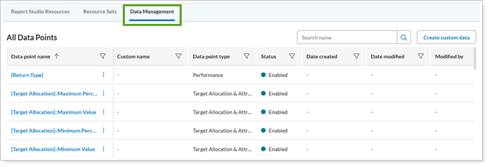
With this enhancement, you can:
-
Rename columns to match firm terminology. Modify default data point names to match your firm’s terminology. For example, rename Average Daily Balance to Average Value.
-
Control which data points are available. Enable or disable specific data points to ensure your reports include only approved metrics.
-
Use merge fields in column headers. Access and apply merge fields when editing column headers to automate dynamic naming conventions.
-
Review data definitions. View concise definitions or open a detailed definition in the Help Center data dictionary for column headers to ensure data accuracy.
Why you'd use it
With the new features, you can create a more consistent and professional reporting experience by standardizing column headers across your Report Studio templates.
Managing data points in Report Studio helps to ensure your client reports reflect your firm’s branding and data standards without being limited by default system labels. This feature lets you exclude metrics if you prefer data from other sources or prefer not to surface certain data points.
How to get started
Firm-level permissions control access to these settings, allowing administrators to grant full or restricted access to the Data Management page.
To manage your data, navigate to Report Studio and select the Data Management tab.
New Risk Scatter Plot Chart module for risk versus returns
What's changing
Advisors who want to show clients how much risk they take on for their returns can now visualize that trade-off directly in Report Studio. The new Risk Scatter Plot Chart module replicates the Risk vs Return analysis previously available in Account Analytics. With it, you can plot net or gross time-weighted returns (TWR) on a two-dimensional grid.
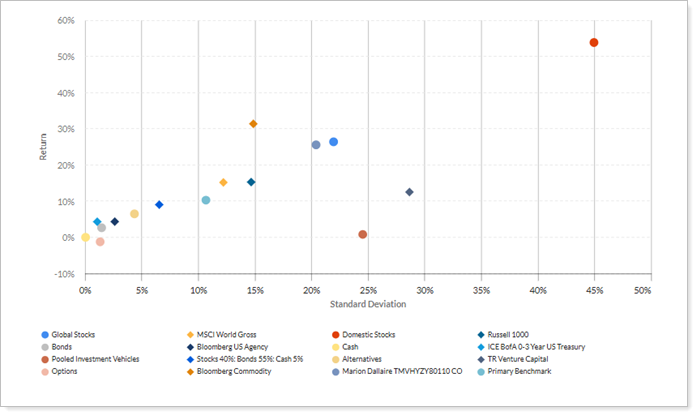
You can group scatter plot data by account, and now by categories like asset class as well – a huge upgrade that extends the analysis beyond account-level views. Account benchmarks, category benchmarks, and additional indexes can also be included. The module also maintains consistent visual output across the Report Studio builder, dynamic viewer, and final PDF documents.
Why you'd use it
Use this to show clients where their holdings fall on the risk-return spectrum, with comparisons to benchmark and volatility if desired. Additionally the Scatter Plot Chart module helps you identify outliers in a portfolio, facilitating more informed discussions about risk tolerance and asset allocation.
How to get started
To add this chart to your reports, open Report Studio and select the Risk Scatter Plot Chart Module from the module library.
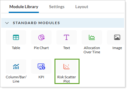
Use the Settings panel to define your X-axis as standard deviation and your Y-axis as return, then apply your preferred Grouping and Legend configurations to customize the display.
For details, see Module Settings.
Additional information
For details, see Using the Risk Return Scatter Plot module.
Create custom data points in Report Studio
What's changing
As an advisor, you need to highlight metrics that reflect your firm's investment approach, not just what’s available in standard reports. With this release, you can create custom metrics tailored to your firm’s analytical needs. Custom calculated columns give you access to a flexible expression builder that lets you perform mathematical operations on numeric data points. You can generate unique reporting columns without waiting for standard system updates.
Why you'd use it
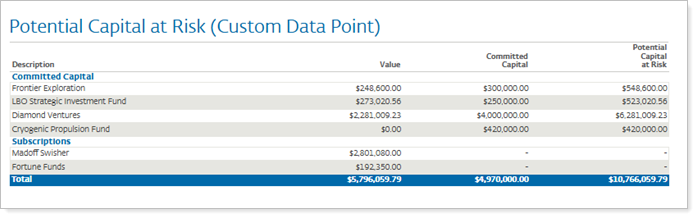
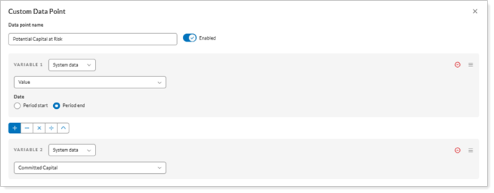
Use this feature to show metrics that are specific to your firm’s investment approach, such as Potential Capital at Risk, which you calculate by adding Current Value and Remaining Capital. Custom Calculated Columns help you combine standard performance data with your own logic, so you can give clients more meaningful insights and include the exact data points they expect in Report Studio reports.
How to get started
To create a new custom data point, in Report Studio:
-
Open the Data Management tab and select Create custom data.

-
Configure the expression as desired to calculate the data point and select Save.
Additional information
For more information, see Create a custom calculated column.
Enhanced pie chart customization in Report Studio
What's changing
This release introduces several enhancements to the pie chart module in Report Studio, giving you greater control over how data is visualized. These updates make it easier to streamline complex data, refine client presentations with cleaner grouping and improved label displays, and keep reports professional and easy to interpret—even when handling numerous asset categories. You can now consolidate smaller asset categories into a single grouping to avoid cluttered charts with too many thin slices.
You can use the following enhancements on pie charts:
-
Separate managed and unmanaged assets. The chart can now segregate managed and unmanaged assets into distinct groupings.
-
Group smaller categories into Other. A new Add 'Other' for weights below setting automatically collapses any asset category below a specified percentage threshold into a single Other category.
-
Rename the overflow category. Use a custom name for the overflow category instead of the default Other label.
-
Show what Other includes. Display the specific contents of the Other category as a footnote directly below the chart, ensuring full transparency of aggregated data.
Why you'd use it
Use this to create more impactful visual summaries for your clients by eliminating distracting, tiny pie slices that represent negligible portions of a portfolio. For example, if a client has 20 different stock holdings that each represent less than 1% of their total assets, use the Add ‘Other’ for weights below setting to group them into a single slice labeled Other Equity Holdings.
This feature lets you maintain a clean visual while using the Footnote option to list the individual holdings at the bottom of the module, providing the necessary detail without compromising the chart clarity.
You can also use Asset Segregation to clearly distinguish between assets you manage and those held elsewhere, providing a more comprehensive view of the client's financial picture.
How to get started
No action is needed. These new options will be available to add to pie chart modules after the release.
Additional information
For more information, see Add Other for weights below.
Bar and Line chart enhancements in Report Studio
What's changing
In client meetings, you may need to compare a client’s account performance with a benchmark over time. Having a single, clear chart makes that conversation easier. With this release, you can create clearer performance charts in Report Studio by combining bars, lines, and benchmark data in one chart.
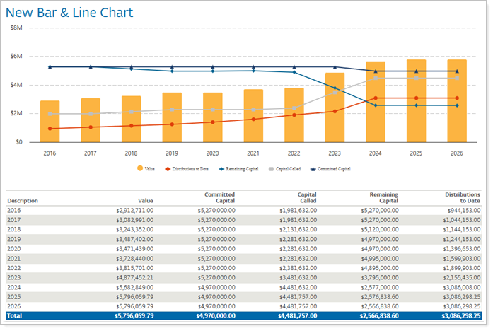
Showing lines and bars in one chart lets you do the following:
-
Combine bar and line charts. Create more engaging visualizations by displaying bar and line data together in a single chart.
-
Compare results across time periods. Show multiple historical date periods in one bar chart to highlight trends and changes over time.
-
Include benchmark returns automatically. Add annualized or cumulative category, account, or group benchmark returns when you select return data points.
-
Customize legend labels and axis titles. Choose how you want to display legends and axis labels—whether more detailed account names and labels, or simpler, generic labels and minimal axis labels.
Why you'd use it
Use Report Studio’s advanced charting features to create clear, data-rich visuals that compare performance over time, track benchmarks, and help clients understand investment results. Customize how each report appears to align with your branding and clients’ needs.
How to get started
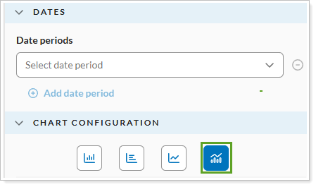
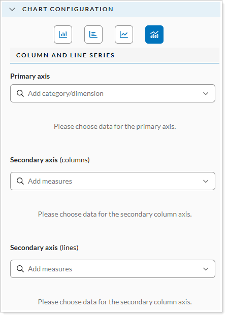
To access these features, in Report Studio, open a Bar/Line Chart module. Use the Settings panel to turn on Combined Chart. Add date periods or select the benchmarks you want to include.
Further refine the display by adjusting the Legend and Axis configurations to match your firm’s reporting standards.
Additional information
For more information, see:
-
Module Settings
Available in beta: Create and analyze reports with AI
What's changing
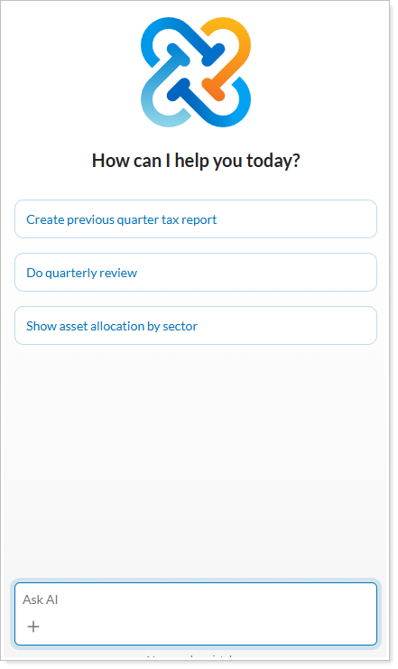
Report Studio now includes AI-driven features that automate report creation and analysis. The new migration tool to convert legacy reports into modern templates using PDF parsing and vision technology and use the AI Data Analyst Agent for context-aware insights and complex date-range queries. For all AI tools, the Tamarac platform logs every interaction and saves immutable audit logs. Additionally, input guardrails filter harmful or off-topic prompts to ensure professional standards. AI-Assisted data migration tool.
Use AI prompts directly in Report Builder to modify all module types, allowing manual and AI edits to coexist seamlessly. This tool can convert your existing dynamic and PDF reports into Report Studio reports. All you do is validate the conversion after it’s done.
AI data analyst use natural language queries to explore the data for clients and their financial accounts. For example, request a client brief for a specific date range.
Why you'd use it
You probably have many reports in legacy reporting systems on Tamarac. Recreating each of those in Report Studio takes time you don’t want to spend. That’s why you can use the AI-Assisted Report Migration tool to move your existing report library into Report Studio quickly, without losing visual or data integrity. The AI Data Analyst agent simplifies your interactions with the data so you don’t need to create complicated saved searches or specific reports. Just ask a question and get the answer.
Together, these tools help you understand client data and deliver personalized, professional reports more efficiently and with less manual work.
How to get started
To ensure the best experience, we're initially introducing the AI Analyst to a small, select group. If you're interested in being considered for a future wave, use this form and we'll add your firm to the interest list. We'll follow up as additional capacity becomes available.
Additional information
For more information, see Introduction to Report Studio.
Bulk reports
Export current vs. target allocation information in bulk
What's changing
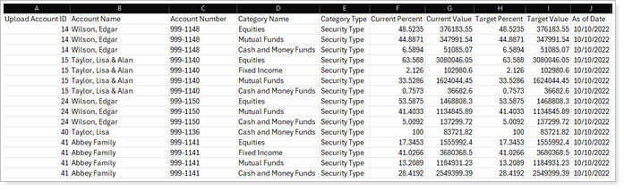
The Asset Allocation dynamic and PDF reports provide powerful comparison tools between a current account allocation and what your recommended or target allocation is. Until now, it’s not been easy to extract that information in bulk for multiple clients.
With this release, you can use the new Account Asset Allocation bulk report to compare current and target allocation data points across all your accounts and groups, as appropriate. You can include any of the Asset Allocation report comparison fields you use in dynamic and PDF reports, including current and target value, current and target percent, variance by category, maximums and minimums, and more.
Why you'd use it
This highly anticipated enhancement lets you export this critical asset allocation data in bulk. Instead of accounts and groups individually, you save time by reviewing and comparing target and current allocation information for large numbers of client accounts at once.
How to get started
This new report is available by default after the release.
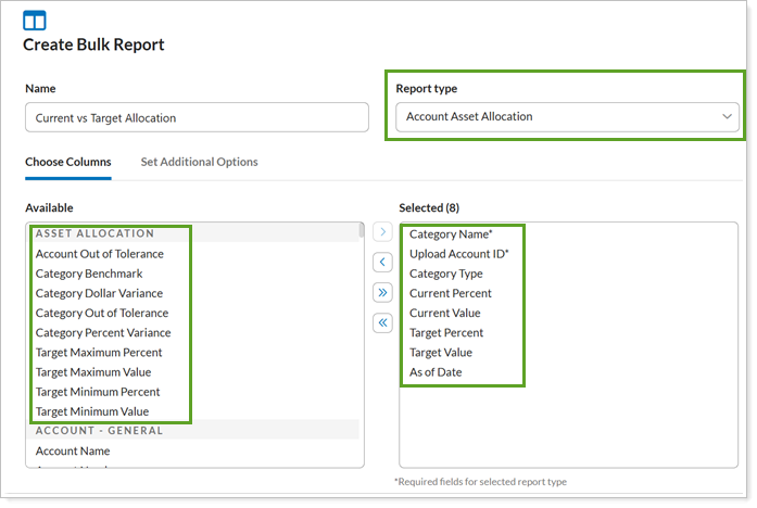
To access the new report, in Bulk Reports, set the Report type to Account Asset Allocation.
When creating the report, select from new Asset Allocation column list as well as from all your standard data points.
Additional information
For more information about generating bulk reports, see Run a Bulk Report to Export Data in Bulk.
For more information about all the types of bulk reports you can run, see Bulk Report Descriptions.