
Contents
How Show As Works on the Asset Allocation Report
| Applies to: | ||
|---|---|---|
| ✔ Dynamic | ✔ Client Portal | |
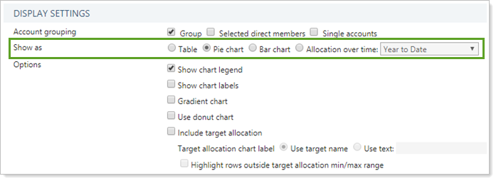
Many of our reports offer a variety of ways to visually display the data. One option you'll see on several reports is the ability to see the data as a variety of different charts types. This setting allows you decide what type of table or chart is shown. Each option helps you tell a different story.
Click the chart type listed to learn more.
| Chart Type | Why Choose This Type |
|---|---|
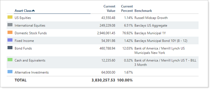
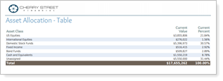
| Moment-in-time snapshot good for simply reviewing holdings. | |
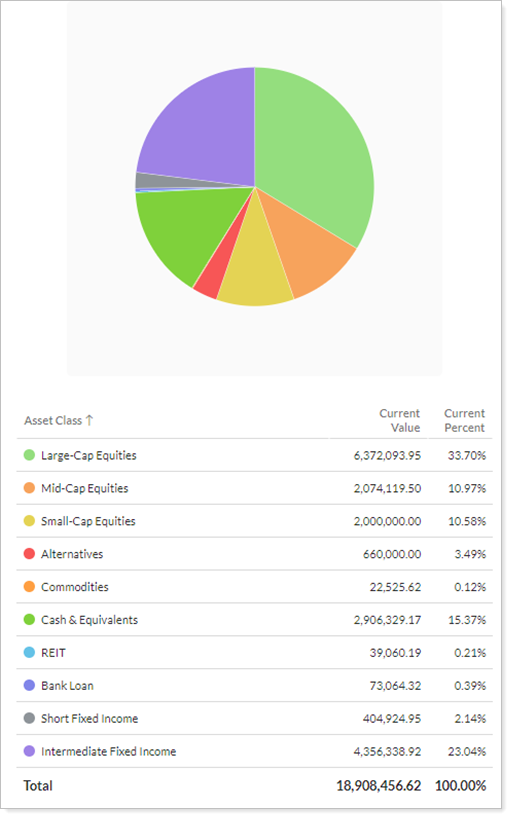
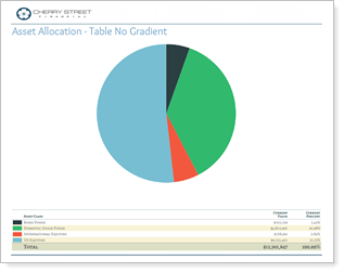
| At-a-glance visual breakdown of the moment-in-time holdings within the account or group. Includes a summary table. | |
|
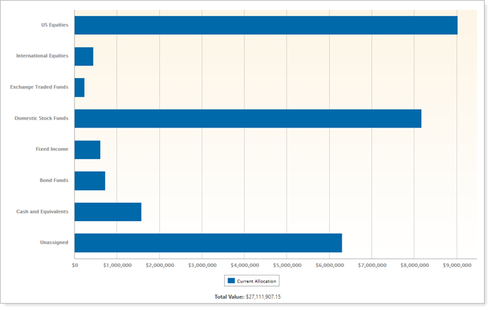
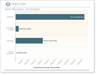
Moment-in-time snapshot emphasizes amount of holdings in each grouping. This is an especially useful chart when comparing current allocation to target allocation. |
|
|
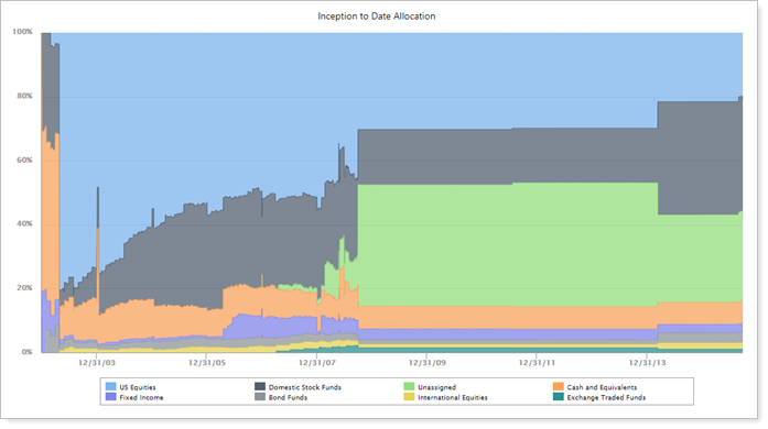
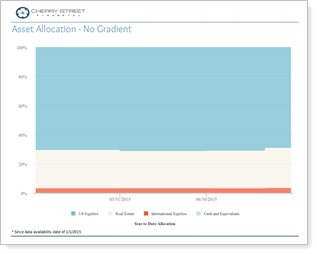
Useful when used in conjunction with other reports, such as Account Performance report, which can together show when allocation changed and the impact that change had on performance. |
In Dynamic Reports

You can choose any of the following:
-
Table
-
Pie chart
-
Bar chart
-
Allocation over time
In PDF Reports
All four of the chart options are available in PDF reports.
-
Table
-
Pie chart
-
Bar chart
-
Allocation over time
Reports With This Setting
Holdings ReportsPDF-Specific Reports
Related Settings
For more information about date periods, see Dates and Date Periods.
The following Asset Allocation report setting interacts with this option:
|