
Contents
|
Why Use the Rebalance Summary Charts Report? |
Introduction
| Applies to: | ||
|---|---|---|
| Dynamic | Client Portal | |
The Rebalance Summary Charts PDF report section lets you visually display and compare data about proposed trades. You can also customize your chart legends, labels, and more.
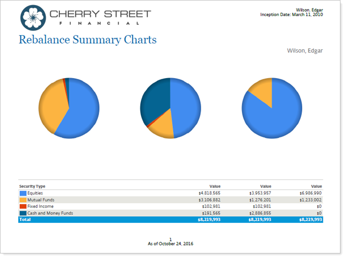
Use the Rebalance Summary Details PDF report section alongside this report to show data points of the proposed trades.
Why Use the Rebalance Summary Charts Report?
This report lets you present data that answer these questions:
-
How does a pie chart of the initial account compare to the account after the rebalance?
-
How does the initial account and/or post rebalance account details compare to the model target?
Features in the Rebalance Summary Charts Report
Here is a summary of ways you can display data on this report:
-
Grouping.Group your visuals and chart by choosing from a number of categories.
-
Compare visual data.Add one, two, or three pie charts to compare different rebalance summary data points. Add an optional chart legend.
-
Adjust Graphics.Add a gradient or display data as donut charts.
Settings in the Report
When customizing a PDF template that will contain the Rebalance Summary Charts report, you can use these settings to customize how the report will appear:
Basic Information
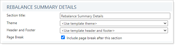
- Section Title. Designate what the section will be called in the PDF report.
- Theme. Designate what theme the section will use or use defaults.
- Header and Footer. Choose a unique header and footer for the section or use defaults.
- Include Page Break After This Section. Control where page breaks occur in the PDF report.
Chart Options
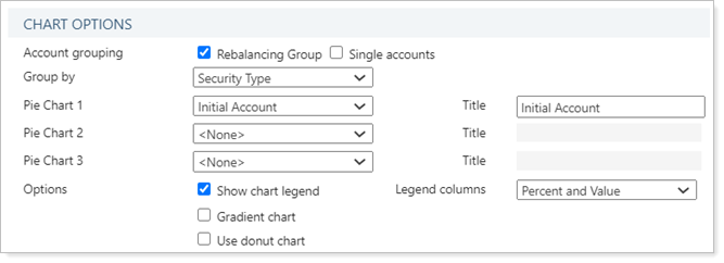
- Account Grouping. Control the output of this PDF report section to include rebalancing groups, enabled individual accounts, or both.
- Group By. Group by security level model, target allocations set at the account level, or one or more levels of security category, such as asset class or security type.
- Pie Charts 1, 2, and 3, Title. Designate the data used as the basis of one, two, or all three pie charts in this PDF report and add a caption to each pi e chart.
- Show Chart Legend. Control whether or not this report will contain a chart legend to accompany the pie charts.
- Legend Columns. When showing a chart legend, designate the kind of data shown in that legend.
- Gradient Chart. Add an optional gradient color to the pie charts.
- Use Donut Charts. Display the charts as donut charts.
Use This Report
After customizing your PDF template, here are ways you can take further action to generate, edit, and delete reports, as well as share them with clients.
To learn more about reports in Tamarac, see Introduction to Reports.To learn more about how to generate a report, change the data displayed, print or export the report data, and more, see Basics of Working With Reports.To learn more about creating and using PDF reports, see Understanding PDF Reports and Workflow: Generate a PDF Report.