
Contents
How Show Line Chart Works
| Applies to: | ||
|---|---|---|
| ✔ Dynamic | ✔ Client Portal | |
Many of our reports offer a variety of ways to visually display the data. One option you'll see on several reports is the ability to see the data as a line chart.
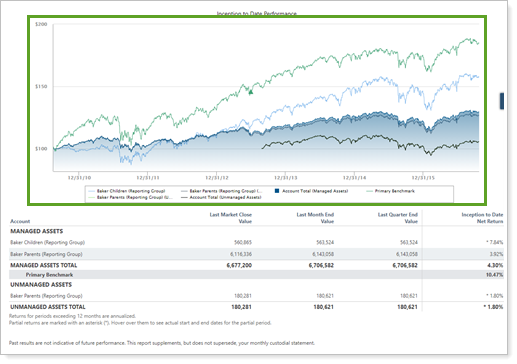
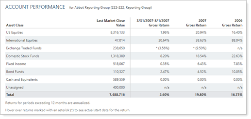
This setting allows you to show a line chart of performance for accounts, groups, categories, benchmarks, or indexes on the report, then select whether they are shown in percentage or dollars.
Displays for Linked Returns and Missing Intervals
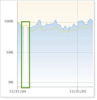
When reporting on a linked return, the line chart shows all available data. In this case, on days where intervals are broken or missing, you'll notice:
-
A gap in the account line on those days.
-
No tooltip available on those days.
In Dynamic Reports
-
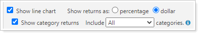
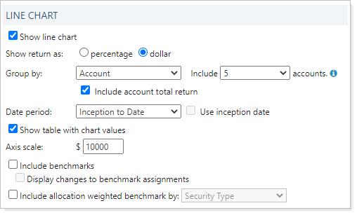
To see the line chart, select the Show line chart check box. Choose how you would like returns displayed. You can choose percentage or dollar. The date period for the line chart is set by the first period chosen in Show return or net investment gain list.
When you show the line chart, you can configure it with the following settings:
-
To hide the line chart, clear the Show line chart check box.
In PDF Reports
In PDF reports, this chart is sampled at the following rates:
- When plotting 0 to 10 years on the x axis: Sampled every 1 day
- When plotting 10 to 20 years on the x axis: Sampled every 7 days
- When plotting 20+ years on the x axis: Sampled every 30 days
Functionality is the same in the PDF report templates as in dynamic reports.
When using this setting in PDF reports, the following settings appear:
Reports With This Setting
Related Settings
For more information about setting up how charts look in dynamic reports, see Site Themes. For more information about setting up PDF template themes, see Understanding PDF Themes.
See also: